
Schuster Fraktur is a revival of Johann Friedrich Unger’s Unger Fraktur, originally designed in 1794 with his business partner Johann Christian Gubitz.
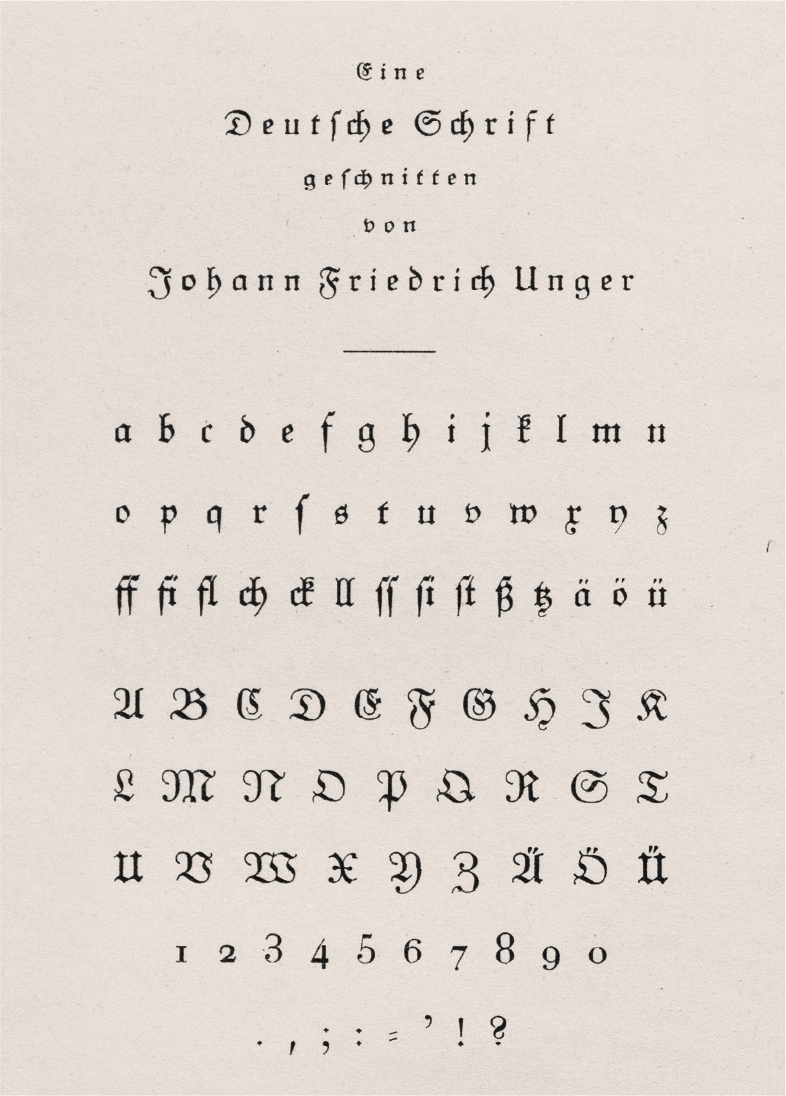
The sources I referenced are specimens from two foundries—Original-Unger-Fraktur (1915) by Schriftgießerei Gottfried Böttger, and Original-Unger-Fraktur (1925) by H. Berthold AG.
The typeface represented in the Berthold specimen is the same typeface shown in the Böttger specimen, as Schriftgießerei Gottfried Böttger was acquired by Berthold in 1918. To view the referenced sources, I traveled to the archive at the Deutsches Technikmuseum in Berlin to make scans. I also looked at specimens for Walbaum Antiqua from Berthold, as it was another typeface present in the book I chose.
Initially, it was intention to create a faithful reconstruction of the original typeface as it was. I wanted to change as little as possible, and not create a “Frankenstein” project. Throughout the process of digitization, proofing, and discussions in class, I determined that the success of the project would be in jeopardy if I stood firm in this approach. I realized that although the original design was effective for the context it existed in, if I wanted the typeface to be of any use to a broader audience, it would need to depart from the original design in targeted areas.
The original typeface was designed to be legible and highly readable, and was designed with a changing world in mind. Although Unger wanted to update Fraktur to modernize German type, the world has left Fraktur behind. My goal for the revival was to find a balance between old and new to update the design while maintaining the original vision and goals of Unger Fraktur. In homage to the beauty of Unger’s original design, I decided to keep the original forms in the typeface that are accessible via a stylistic set.
The first changes were made to the lowercase k, v, w, x, and y. These letters were the furthest outside of what would be considered recognizable to modern Latin readers. Deciding on the structure for these letters was not a simple task, as I needed to both make the letters recognizable in their modern structure while also maintaining a connection to the original design. By studying the rest of the letters in the typeface, I was able to make a compromise in the design of these letters to match the spirit of the original while also creating a more modern structure that is easier to recognize.

Above: Digitization based on Unger Fraktur’s design
Below: Newly designed letters for Schuster Fraktur
As I progressed on the digitization, it became clear that many of the capital letters were too far removed from Latin capital letters and alternate structures would need to be explored. Instead of making alternates for a few specific letters, it was determined that an entire new set of capitals would be more beneficial to the project. To achieve this, a new source would need to be referenced.
Emil Rudolf Weiß created Weiß-Fraktur in 1913, which was directly inspired by Unger Fraktur. Weiß Fraktur featured many differences from Unger Fraktur that make it more approachable to modern Latin script readers, most notably in the capital forms. Many of the more traditional Fraktur structures were changed to a mix between Antiqua and Fraktur. These hybrid forms were beneficial to reference for the design of Schuster Fraktur. Unger believed that Fraktur should evolve with society, and I feel that the changes I’ve made align with that philosophy. Although the new letterforms may be far from the original design, society has changed greatly as well.
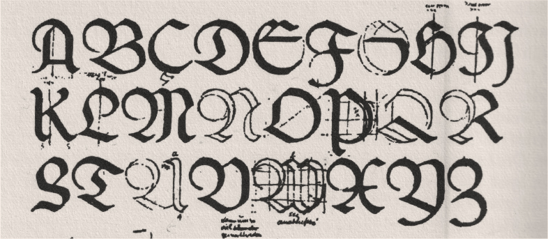
Utilizing this new source, I sketched a new set of capital letters. I started by sketching directly over Weiß’s sketches of Weiß-Fraktur, which had a clear calligraphic style to them which I found attractive. I then refined the sketches from there to introduce variations in the contrast that more closely aligned stylistically to Unger’s original set of capitals.
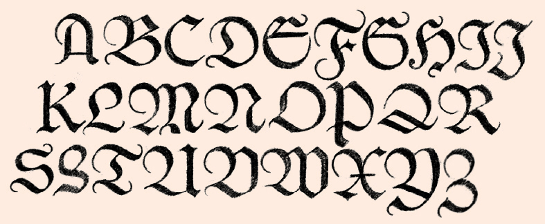
For some letters, such as the capital M and F, I took parts of the structure from Unger Fraktur and parts of Weiß Fraktur to create a hybrid. For other letters, I created something new based on what I had learned from both sources. For example, the capital I is differentiated from the capital J, and the capital C, E, G, and K are very different from both sets, but still fall somewhere between the two.

Above: Digitization of Unger Fraktur’s capitals
Middle: New set of capitals for Schuster Fraktur
Below: Weiss Fraktur digitization by Gerhard Helzel
In total, Schuster Fraktur contains 627 glyphs. The base set includes Uppercase and Lowercase, numerals, punctuation, special characters, and glyphs in the Latin Extended-A Unicode block. It also includes a stylistic set and discretionary ligatures for setting Fraktur type in its original format. This stylistic set includes alternate lowercase forms, capitals, and a dot accent & dieresis that follow Unger’s original design.


